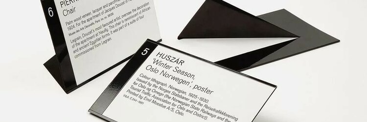
What do you think a good museum label should look like? What original approaches have you encountered in this case?
Nowadays, you can see completely different approaches to labeling for exhibitions and permanent expositions: sometimes this becomes the subject of really big disputes and complaints from visitors. But sometimes an original approach makes an exhibition special.For example, at the exhibition "Neobegda" in the Tretyakov Gallery, labels resembled the aesthetics of tear-off calendars. Do you remember anything like this?

I really liked the move that Manege used in the sensational exhibition “Deineka-Samokhvalov” last year. The works of both artists were mixed up, and to make it clear from afar who was who – each label had, in addition to the usual text with the name, title and date of the work, one large letter – D or C. Thus, even without approaching the canvas, you could immediately understand who the author was. It was really very convenient. I don't know if this is an original solution, but I haven't seen it before.
Here you can see what the exhibition looked like. In general, it has an original exposition solution-like a football match between the teams of Moscow and Leningrad.
The Erarta Museum of Modern Art has taken an original approach to this issue by creating the project “Izolyteratura”.
The works in the museum exhibit have special pockets, where laminated cards with essays are enclosed.
“The most successful examples of izoliterature seem to be woven into the fabric of an existing artistic creation, expanding it and revealing its inner meanings, often deeper than the original author's idea. This is not a critical or art criticism project, but rather a myth-making project.”
“…no one bothers to consider the viewer as an independent actor, a creator of art. A spectator is always nothing more than a spectator, a connoisseur, a fan. Authors don't create a dialog with them, because they are not interested in feedback. But ignoring the viewer in creativity is ignoring creativity itself.”
“The audience in this project has the opportunity to express themselves, voice their experiences, their vision of a particular work in the form of an essay. Thus, not just a comment on the picture is born — the interpretation goes beyond the boundaries of the author's idea, adorns it, gives it new forms and meanings. So the viewer becomes an artist himself. Selected audience essays are actively displayed in the museum halls, creating a great exhibition.”
Источник: https://www.erarta.com/ru/museum/projects/detail/izolit/
Extremely simple, but original…simplicity strikes the world on the spot, but originality is just very intriguing.For this reason, there is no other way…this is a museum! Not the house of Soviets.